
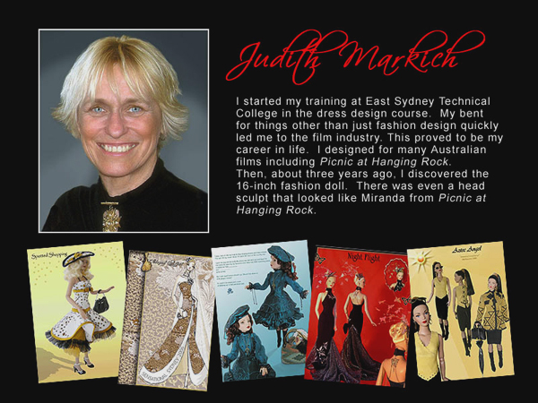
This is a copy of my blog from 2007. it was such a journey over many months that i thought it was worth saving for future reference. MOST PHOTOS CAN BE CLICKED ON TO ENLARGE
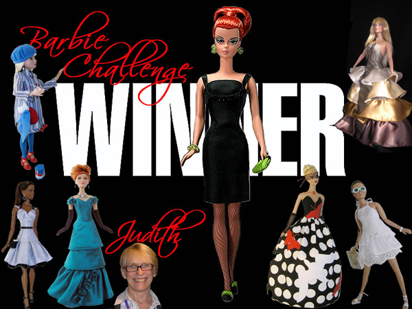
Project Dollway is the first worldwide search for The World's Top Doll Fashion Designer and is only made possible by the Internet. Designers from around the globe submitted portfolios of their work and twelve International designers were selected to compete in challenges that involved the leading fashion dolls manufactured by major doll companies. Each challenge features a different doll and the actual doll designer is a guest judge. It was the brainchild of Ted Menten.
This was my submission for entry into the competition.
This was my submission for entry into the competition.
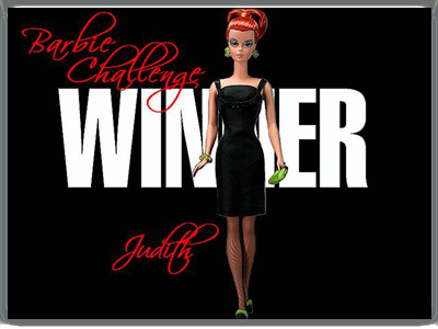
I was lucky enough to win the Barbie Challenge and the Internet popular vote for 4 of the challenges:
Ellowyne, Susie, Barbie and the Alex challenge.
I was runner up in the competition after the final 12 outfit collection challenge and the winner of the internet popular vote overall !!!!
Ellowyne, Susie, Barbie and the Alex challenge.
I was runner up in the competition after the final 12 outfit collection challenge and the winner of the internet popular vote overall !!!!
The following notes & pictures from each challenge are taken from my blog and were added after each design was finished. It was a journey that I now share here so I'm afraid there is quite a lot of scrolling involved :-) Enjoy!!
The first 9 Challenges are on this page, to go straight to my final Challenge 10, The "COVERS" Collection of 12 garments follow the link below
The first 9 Challenges are on this page, to go straight to my final Challenge 10, The "COVERS" Collection of 12 garments follow the link below
CHALLENGE 1 - THE GENE CHALLENGE
Still in a state of disbelief that I had been chosen as one of the twelve designers to compete in Project Dollway I embarked on the first challenge using Gene as my model. When I begin a design I tend to have both style and fabric in mind and then I head off to the fabric shops. This is where the first problem starts and compromise becomes part of the challenge. I settled on silk, pleated georgette and a shiny patent trim currently in fashion. With brief in hand ( a Red Carpet gown for Gene) I started work in fear and trepidation. I made the challenge much harder for myself than I should have. Instead of going with my instinct I thought more must be better and off I went. Well, the skirt changed a few times, the collar went everywhere it could just for fun and the when I finally decided on the skirt style I reduced the amount of fabric in it about 3 times. I should have known that when my outfit started out this way I was never going to be entirely happy with it. From all the designing I have done both in fashion and film the designs I am happiest with are the ones that bring themselves together as I work. They travel their own path and I provide the means to make them happen. Does that make sense? This challenge somehow went off on a tangent but it did represent me and what I am about in It even got to the point where Gene lost her head she became so giddy with all the changes! :-) Ooops After a few days of mucking around it was time to get serious and decide which way to go with the design. Here are some working photos.

|

|
The photos below are how I visualized my design be worn and includes the challenge description.

Click to enlarge
|
A SPARK IN THE DARK
When I started my design I wanted Drama. I wanted the gown to maintain depth and a little mystery through intriguing lines, layers and rich color. I have chosen teal, a color worn easily by any skin tone and hair color, and black, as it has always been and always will be a color at the peak of evening elegance. I wanted to create something unique that would float effortlessly and elegantly down a red carpet greeting flashing cameras and adoring crowds, the designer's name on every fashion editor's lips. I have included Gene's versatile flounce to enhance the theatrical quality of the gown. Curling and winding gently over her back and shoulders, the flounce can be twisted to reveal a beautiful teal wave or reversed for a bolder, more dramatic look with the deep gloss of black patent. The sequin detail presents a sprinkle of Hollywood magic, glittering with her every movement. This flounce is swept neatly beneath the patent belt forming a dainty peplum below the waist. If she chooses. the dress can be worn without the flounce with an equally dramatic effect. Gene's decolletage is adorned with a flattering halter neck design. It is detailed with an overlay combining teal silk and glossy patent, displaying a delicate centre front detail of sequin and bead work. Her black patent belt sits boldly at the centre of the ensemble, once again, a reference to vintage movie star grande I feel my design transcends time. I have worked to evoke a feeling of theatrical ambience, with a delicate slice of vintage vogue, fused with 21st century flair! |
challenge 2 - ellowyne
After all the stress attached to the first challenge, and not being entirely happy with what I had produced, it was great to find Ellowyne was to be the 2nd challenge. I had recently discovered her and was enjoying interacting with her character in my creations for her. This challenge was to comprise of 5 pieces and take Ellowyne from Day to Night.
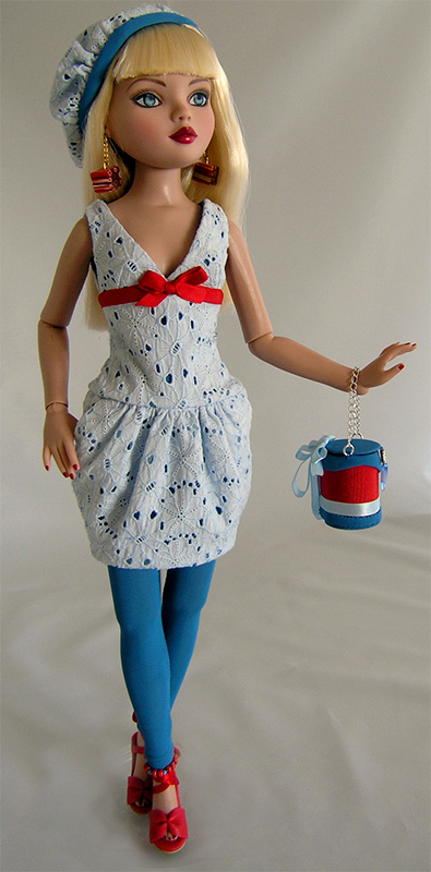
I chose to go with Red White and Very Blue because I liked the story behind her poem, and the line"Dressed in my own designs so new" gave me the inspiration for both her outfit and the fact she could be an artist.
Between these challenges I had to travel to Hong Kong on business (after a short Hospital stay), so everything was happening for me :-). The great thing was I found the fabrics for her outfit in a fabulous little fabric shop in a side street somewhere in Hong Kong. I could have filled a few suitcases with some wonderful pieces but was stopped by a very mean husband. LOL
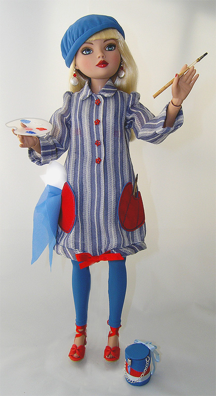
Back home and into the construction of my work of art! My original idea for the smock was to have a white smock with blue and red paint spattered over it but was told (rightly) this probably would not be a good idea if the outfits were being reproduced. Perhaps I'll do one anyway for my own benefit!
The outfit: The smock is a stripe cotton in the same muted blue as the leggings, beret and dress lining. I didn't want a bright blue. The dress is also muted light blue brodrais anglais with the lining colour showing through the lace. The palette shaped pockets hold the painting rags and brushes.
The dress was not made as a formal evening dress, but an outfit a girl in her late teens would wear out at night. Befitting her age without being overdone. There are pockets in the sides of the skirt for posability :-) I felt the styling of this outfit followed on from the original outfit Ellowyne is wearing in RWVB. I used red as the contrast only because of this.
I created the painting and the poem (time was running short by then :-) that Ellowyne would have done in her studio during the day.
My design
|
The evening outfit underneath the smock
|
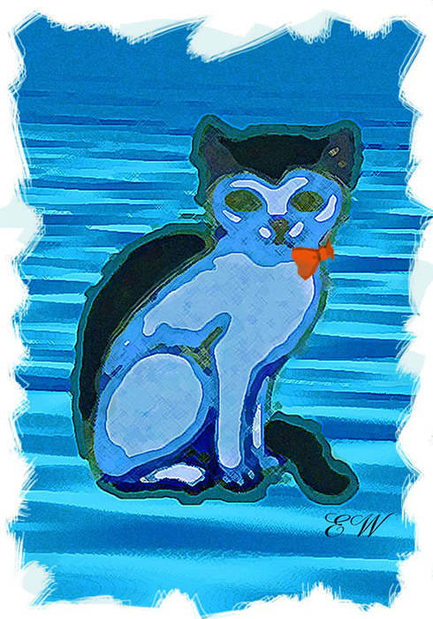
Ellowyne's painting
I paint with flair and from the heart, It's obvious in all my art My cat Sybil models today, I think she'd rather preen and play! But she will see when I am through, How cute she looks in red, white and blue |
Ellowyne won the home vote convincingly!
|
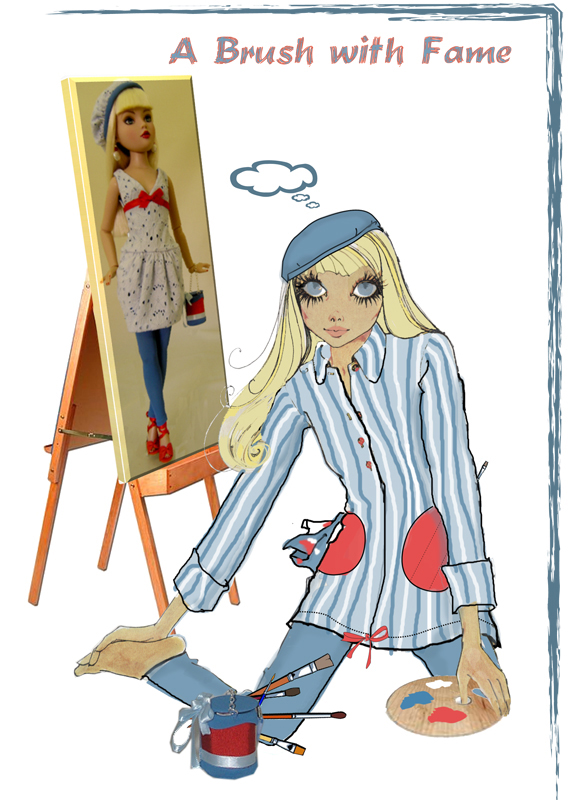
A BRUSH WITH FAME
Many critics have labeled my work "melancholy","morose" and "brooding". Well, perhaps they are right! Fruit bowls, sunsets and babbling brooks are of no interest to me. My paintings portray my moods. They are evocative and unique. I paint in 3 colors only, red for romance, passion and danger, white for emptiness, a peaceful void and I use blue to evoke melancholy and silence. These are my main themes. I selected these colors for my outfit as they are the key behind the success of my greatest paintings. Tonight is most important, and I will be rushing from my studio to the opening of my latest collection of work and I have created a truly memorable outfit for the occasion! After I shed my painting smock, I will appear flamboyantly sassy in my little lace dress, in contrast to my work being displayed on the walls. "Who is she?" I will hear them whisper when they see me. I will keep them guessing :-) My "arty" friends will adore my gorgeous handbag mimicking the paint pots in my studio. My beret will do a clever flip to reveal the matching lace and slide further back on my head. I designed my earrings and had them made by a jeweller girlfriend of mine. How talented she is! It's all red, white and sooooooo very blue! |
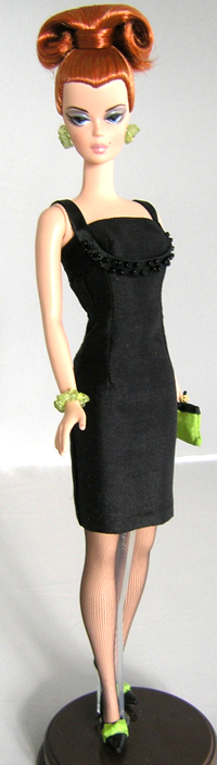
CHALLENGE 3 - SILKSTONE BARBIE
|
THE LITTLE BLACK DRESS PLUS ONE CHALLENGE
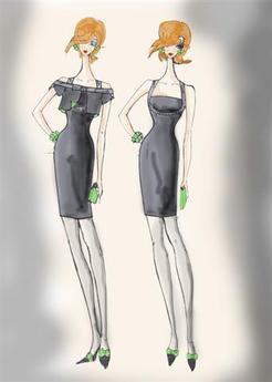
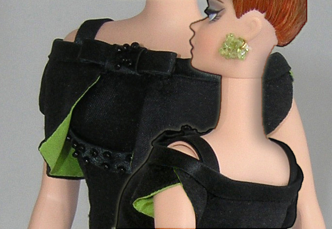
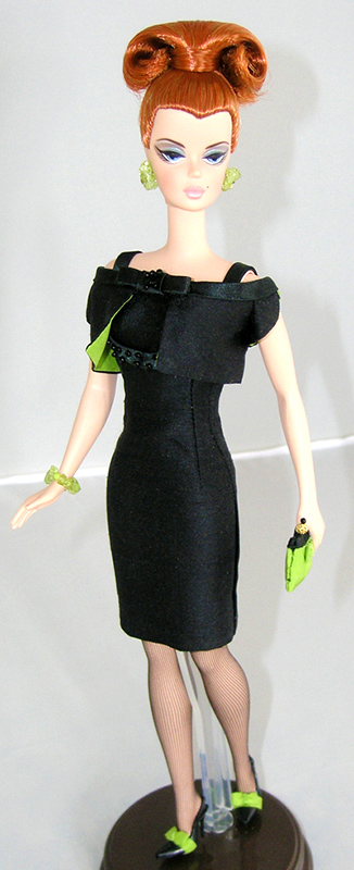
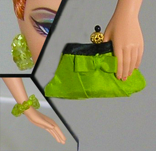
(1 color trim to be used) I had a fairly good idea of the sort of outfit I wanted to create for this challenge but I started in fear and trepidation of working with this tiny doll. I needed to reduce the size of my fingers and my sewing machine :-) Silk dupioni was my fabric choice with satin trim on the dress straps and jacket and lime green for the trim. At least it didn't take too much fabric so I had plenty when it was time to remake the jacket because my sewing was less than perfect. :-( As I progressed into the challenge I found I was quite enjoying the way the silhouette was progressing. She has an excellent shape for dressing, no lumps and bumps and her curves are in all the right places :-) I lined the dress in white which I would not normally do but because of staining issues I thought this was a good option. |
|
The dress came together quite smoothly compared to the jacket, which was incredibly fiddly to do. The tiny sleeves had to overlap at the shoulder in a scallop and be set into the satin running round the arm. After a few attempts at this I was happy with the result.
Overall I enjoyed this challenge when the fear of this size doll subsided and I realized she was a great model for any designer. My notes are below with my reasoning behind the design and my photos of the finished outfit. |
|
|
Click to enlarge
|
challenge 4 - tyler
THE LARGER THAN LIFE CHALLENGE - USE AN OVERSIZE PRINT WITH AN OVERSIZE FEATURE IN A BALLGOWN
It took me quite a while to decide on which fabrics to use. I even searched the curtain and manchester departments in the fabric store. Most of these fabrics were just too heavy to use on a doll this size, although there were some very interesting machine embroidered pillowcases and sheets.
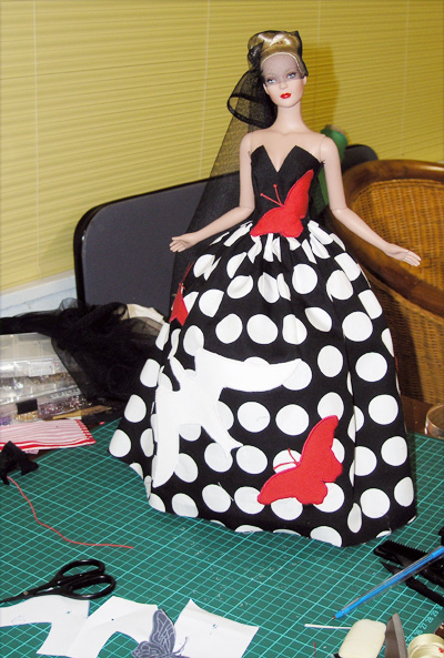
I ended up with clear bright colors because I thought they would be more effective and have a better overall effect for the finished design. We were given directions to use the silhouettes provided in the photos so that was inhibiting to begin with and as it turns out shouldn't have been because I could have expanded on that and not been quite so literal. That said I went ahead and chose a big black and white spot with red and white accent colors in the applique.
I began with everything including the kitchen sink and then started removing pieces until I was left with a more wearable creation :-) When I had finally decided on my design it was then time to start the applique. Well, this gown gave me more grief in the sewing department that the first 3 challenges put together. I think my machines decided they had done enough tricky stuff and spat the dummy! Especially when it came to the butterfly crossing from the bodice to the skirt!
The overlocker played up, the satin stitch played up and even the zip broke AFTER I had put it in! The mittens were a nightmare. This little baby was just jinxed in the sewing department.
Sewing aside however, I did enjoy the challenge of using an oversized print to advantage on this gown. I was also able to incorporate some of my favourite selections in design i.e. spots, butterflies, black, red and white in combination and using cotton as a fabric base.
My notes are below with my reasoning behind the design and photos of the finished outfit.
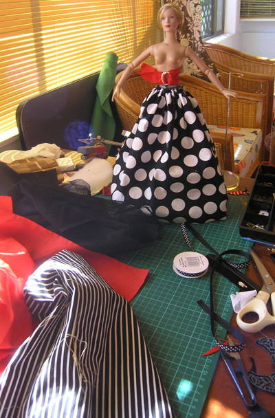
The beginnings
|
The dress
|

Too much?
|
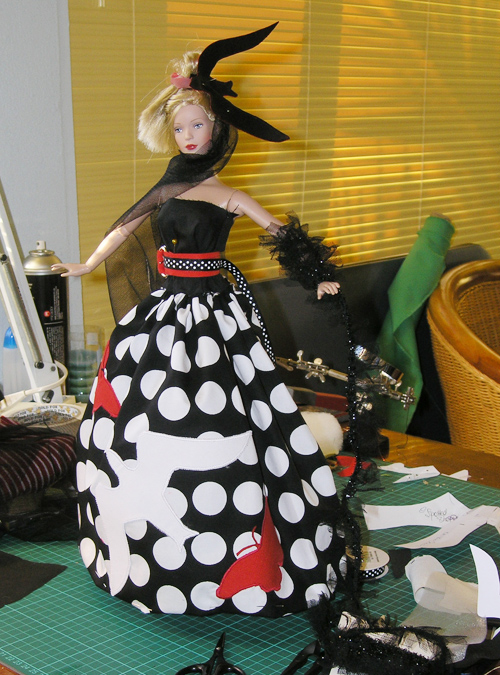
Belt! Head piece! All too much!
|
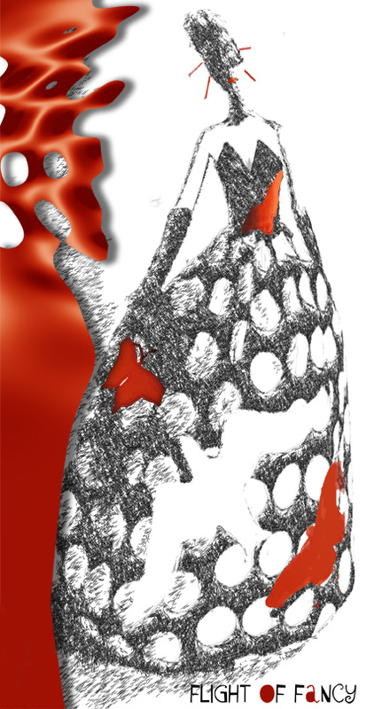
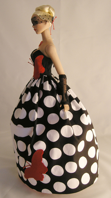
FLIGHT OF FANCY
I wanted to create something that was elegant, striking and audacious. I believe my oversized print presents the perfect opportunity to introduce bright, bold colors. Black, red and white were my choice as I felt they made a wonderful contrasting statement.
- The "element" I have used is the butterfly silhouette applique splashed on the bodice and edging onto the pleats of the skirt. I love the essence of liberty and reckless abandon that the butterfly symbolizes. I have combined this image with the soaring wings of the giant white bird, again symbolic of freedom and a sense of adventure without constraints.
- The eye mask and mittens add to the overall effect without detracting from the contrast elements in the gown. They are a subtle addition that I feel add a sense of theatre and an air of mystery to the complete story.
- I have carefully used silhouette styling to make my statement through color and size, and have adhered to a distinct Japanese flavor mostly through my chosen colors and the use of the butterfly motif.
- I have kept my applique to the front of the ball gown as the print is quite large and I believe the back of the gown benefits from the monotones with a surprise "element" observed as the gown swirls and twirls on the dance floor!
- I used a simple but elegant cut for my gown to allow the print and appliques to dominate.

|
|
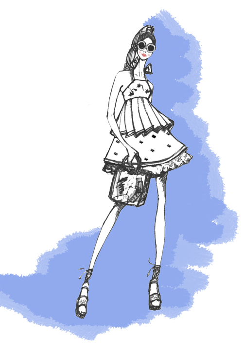
CHALLENGE 5 - SUSIE
Susie wins the home vote!
The Challenge - Take Susie any where in the world and dress her in a contemporary outfit inspired by the local fashion, fabric and traditional dress. She must look contemporary but the local color must be obvious and reasonabiy authentic.
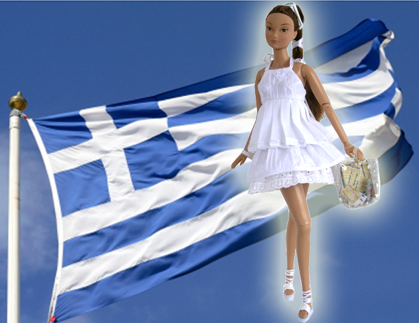
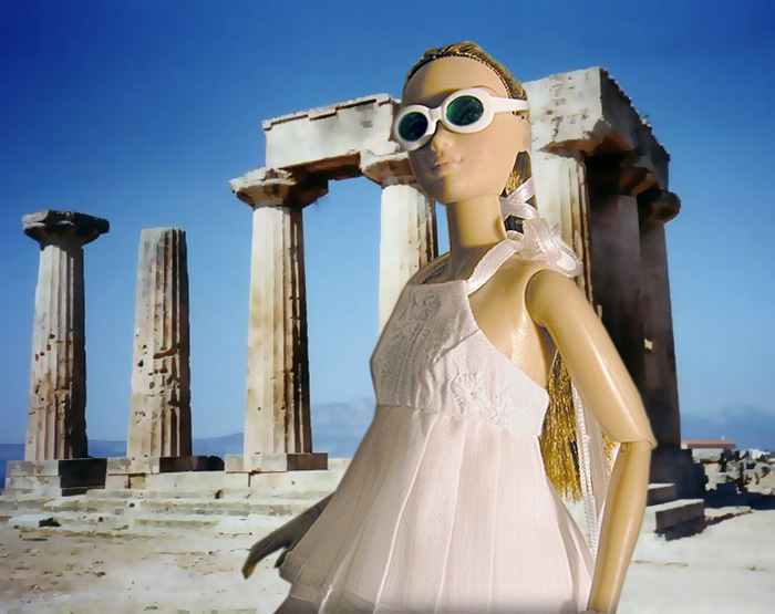
This challenge was one of my favorites. I loved "Adaptations" as a subject in Design School so this outfit was going to be fun to create. Right from the start I decided Greece was the country I wanted to use. I love ancient greek costume and Susie from RandD Angel was the perfect model to show off my design.
The outfit had to be white and I decided ALL white was the way to go.I didn't want to introduce a color because I wanted a uniform look. My biggest problem was finding the right scale lace for the hem trim and it didn't happen until late in the day. I had already made up a skirt in a larger scale lace and every time I looked at it I cringed. After days of searching I found what I considered the perfect trim because even the pattern of the lace had a greek flavor! The design itself looks quite simple but there are a lot of different pieces put together to achieve the final effect. I used ribbons, cord, crinkle cotton and embroidered cotton and lace, but I think they all blended together nicely.
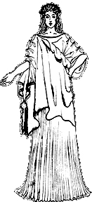
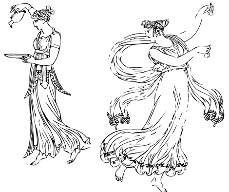
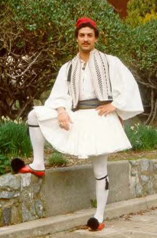
Before I started I asked family and friends what "white and pleats" evoked in the way of countries and most of them said Greece, so I went with that as a premise to build on. This is some of my reference material.
This challenge was one of my favorites. I loved "Adaptations" as a subject in Design School so this outfit was going to be fun to create. Right from the start I decided Greece was the country I wanted to use. I love ancient greek costume and Susie from RandD Angel was the perfect model to show off my design.
The outfit had to be white and I decided ALL white was the way to go.I didn't want to introduce a color because I wanted a uniform look. My biggest problem was finding the right scale lace for the hem trim and it didn't happen until late in the day. I had already made up a skirt in a larger scale lace and every time I looked at it I cringed. After days of searching I found what I considered the perfect trim because even the pattern of the lace had a greek flavor! The design itself looks quite simple but there are a lot of different pieces put together to achieve the final effect. I used ribbons, cord, crinkle cotton and embroidered cotton and lace, but I think they all blended together nicely.
Before I started I asked family and friends what "white and pleats" evoked in the way of countries and most of them said Greece, so I went with that as a premise to build on. This is some of my reference material.
|
|
|
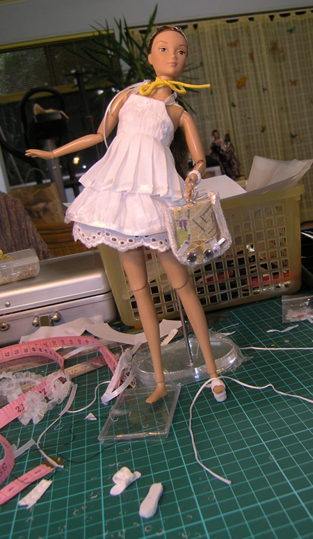
Below are pictures of my work in progress. No one has feet as small as Susie! You can see the difference in the first lace trim and the one I ended up using.

|

|
|
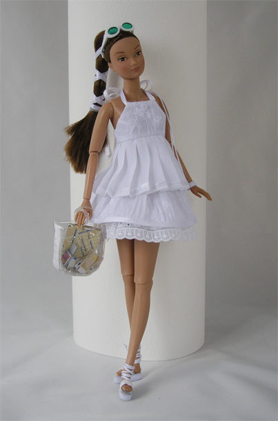
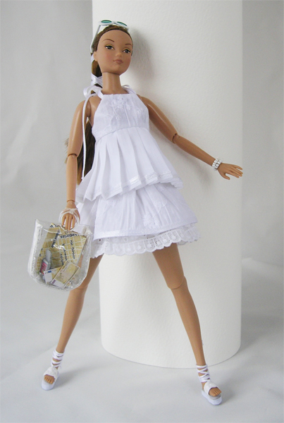
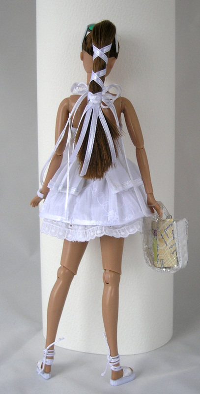
This is how Susie presented herself in Athens and the notes and more pictures are below
|

|
ANGEL IN ATHENS
Susie flew into Athens like a breath of fresh air.
Her new outfit is inspired by characteristics of the costumes of ancient Greece.
She borrowed from the ancient flavor:
Pleats
Pure white
Sandals
Layers
Textures
Ribbons and braids
*Her outfit consists of an embroidered halter top with ribbon edged pleats and ribbon and cord ties at the neck
*A double layer skirt with crinkle cotton overlay and a lace edged under skirt
*Tiny stretch lace shorts for modesty
*White sandals
*Sunglasses
*Bead bangle
*Clear plastic bag ( to maintain the "no" color look) containing the essentials for a girl in Greece
Money, map & mobile :-)
|
|
|
And there you have it. My intrepid little traveller in Athens.
CHALLENGE 6 - ALEX
THE CHALLENGE - Create an ICON dress that relates to a particular scene in a movie of Your choice.

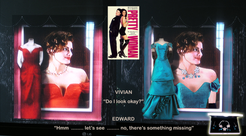
This challenge has been the most difficult for me to date. As a period costume designer I wanted to follow that path, but the choices were so many and I confused myself so much that I decided comtemporary was the way to go.
The choice of Julia Roberts in "Pretty Woman" came when I started thinking about scenes from movies as opposed to the movie in it's entireity. This was not because I loved the movie but because I thought I could redesign her costume successfully. The jewellery scene just seemed the right way to go, so that's where I went :-)
After 3 days searching for the right fabric (What was the right fabric?) I was left without as much time as I would have liked to produce the gown. This challenge came together as the construction progressed. I was happy with my finished gown. I achieved the results I was after for this scene of the film. My working pix and explanation for what I have designed is below.

|

|
|
|
VIVIAN
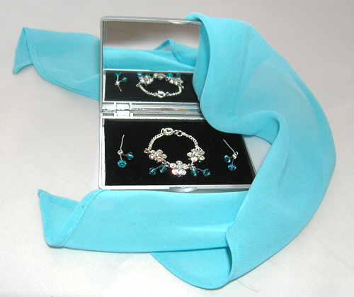
"Do I look okay?" EDWARD "Hmm .......... Let's see ........... no, there's something missing" That's when Edward produces the jewellery box with the diamonds 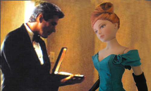
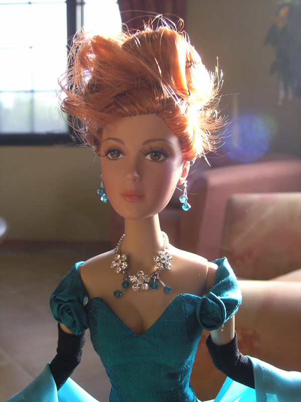
Alex takes over the part in her new costume :-)
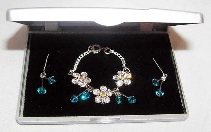
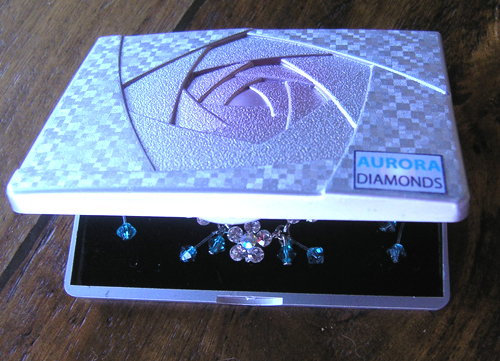
The new jewellery
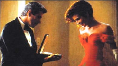
The original scene from the movie
|
The original gown designed for this scene was red with white gloves. I have changed both these colors to sea green and black, respectively. I have done this because I feel red was not the best choice of color, as it conveys the trappings of "prostitution" which is the last impression this scene is trying to communicate. I have used black gloves instead of white because they are more subtle and shouldn't be the centre of attention - white cannot help but stand out on screen. I also felt the change of gown color was a better "fit" with the color of Julia Robert's hair. I was looking for an overall impact when she appeared at the doorway in the hotel.
With the design I wanted to present Vivian as a "princess for the night" with just a little fantasy thrown in, so the gown is very feminine without losing the contemporary style features. She must look elegant and sculpted. I have used a more tailored silhouette with feminine adornments. I thought the original gown was perhaps a little fussy with fabric falling from the wrong position ( the stomach area). I have kept the frill and rose trim to the bottom of the gown giving a simplicity of line to all close and medium shots with just the roses at the shoulders and necklace for detail. This allows the jewellery to shine but adds interest and movement to the full length camera angles. The decollete neckline of the gown presents a flattering line and leaves a bare shoulder area for the necklace. My gown is in dupion silk because this fabric is chameleon in its colors and changes with the lighting, animating the gown within its simplicity. Some of the jewellery stones match the color of the silk, to pull the outfit together. It is an important part of the concept of the outfit so it was important that the gown and jewellery team together well. They were chosen that way by Edward in the film. The georgette shawl was included for the scene where Vivian crosses the tarmac to the private jet. This is purely for effect as it will flutter in the breeze and the setting sun will make it transparent. The sea green color I have chosen will stand out at the Opera amongst the other cast members (men in black and white, women in neutral shades) without being "in your face", and remain very elegant. Only the language coming out of her mouth gives her away. That's my "take" on how the scene could be presented. |

|

|
"CUT" "PRINT" "THAT'S A WRAP" |
|
"PRETTY WOMAN" starring Alex as Vivian Costumes designed by Judith :-) Alex won the home vote!!!! |
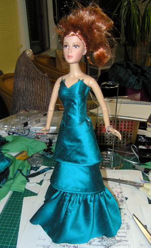
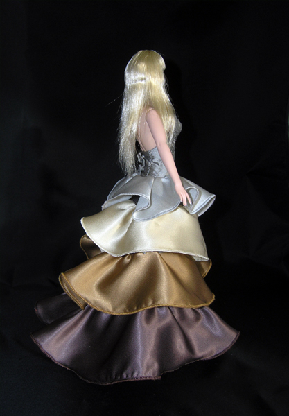
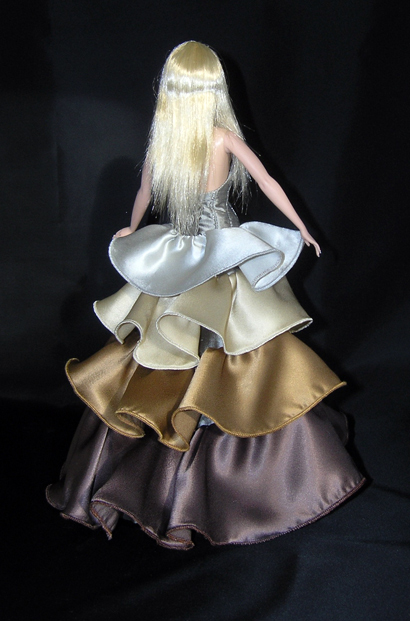
challenge 7 - veronique
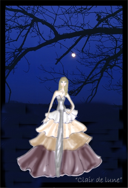
The Challenge - Create a centerpiece garment in a new collection for the FR line, with the Designers point of view – not Jason’s (who is the dolls creator) The collection is called “Joie de Vivre” or the Joy of Life. With the centerpiece set titled : ”Clair de Lune” or Moonlight.
Instead of the blue tones from a night sky I decided to use the colours that moonlight reflects on the earth. The silvers and golds through to the aubergine of the shadows of the night. The dusty tones of the Lunar Moth. This is my "joie de vivre"- the colors that still remain in the moonlight. I wanted a tiered effect with darker tones progressing through to silver. I figured there was some magic with this challenge and a little bit of fantasy was called for on my part. :-)
Finding the colors I wanted was very difficult and not exactly the shades I would have chosen but I am happy with the end result and I think Veronique would be very happy strolling along the beach at midnight listening to the "Moonlight Sonata" :-)
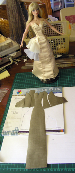
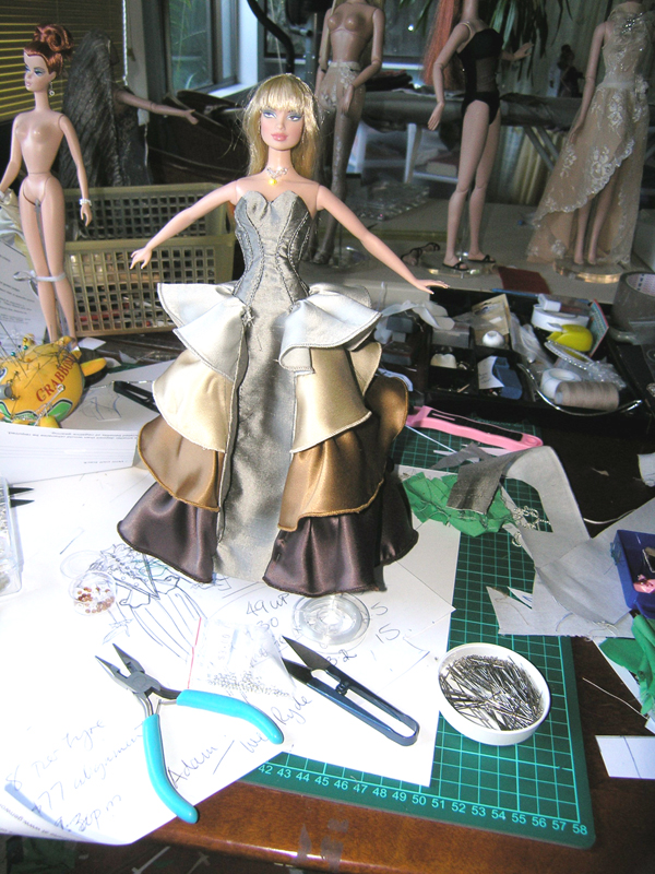
I had a lot of problems in the construction of this gown but that was mostly because I changed things midstream and ended up with everything being done in the wrong order :-( There is no time for remaking on these challenges! Below are my working pix and the final outfit shots along with my notes for this challenge.
Instead of the blue tones from a night sky I decided to use the colours that moonlight reflects on the earth. The silvers and golds through to the aubergine of the shadows of the night. The dusty tones of the Lunar Moth. This is my "joie de vivre"- the colors that still remain in the moonlight. I wanted a tiered effect with darker tones progressing through to silver. I figured there was some magic with this challenge and a little bit of fantasy was called for on my part. :-)
Finding the colors I wanted was very difficult and not exactly the shades I would have chosen but I am happy with the end result and I think Veronique would be very happy strolling along the beach at midnight listening to the "Moonlight Sonata" :-)
I had a lot of problems in the construction of this gown but that was mostly because I changed things midstream and ended up with everything being done in the wrong order :-( There is no time for remaking on these challenges! Below are my working pix and the final outfit shots along with my notes for this challenge.

The Lunar Moth
|
|
|
INTRODUCING

The "Joie De Vivre" collection
The Joie de Vivre Collection has a certain "je ne sais quoi" quality, an exclusiveness difficult to describe but exuding an unrestrained sensation of free spirited charisma.
This can be witnessed in the Centrepiece gown, Veronique in "Clair de Lune" . She is the essence of joie de vivre. Passionate, sophisticated, carefree and liberated. In a previous life she might have performed the French Can Can at the Moulin Rouge, swishing layer upon layer of frilly skirts high in the air.
Her gown has evolved into a transforming tone of colored frills to suggest the shades of moonlight cascading from silver ,though gold to the darkest shadows on the bottom frill. The delustred satin shimmers as moonbeams bounce on the frills as she glides along.
Her corseted silk bodice brings a sense of stability to the gown, with silver thread completing the panels. There is added detail with tiny rouleau buds gracing the front and back bodice as if still emerging into life.
The front decollete has a tiny crystal in the centre of the bud gleaming like a moondrop when the light strikes it. Veronique wears a crystal necklet on invisible thread. The crystals seem fall from nowhere .
She holds a purse made of rays from the colors in her skirt,with a crystal clasp.
The "joie de vivre" collection will truly be a sensory feast for the fashionistas

|
|
|
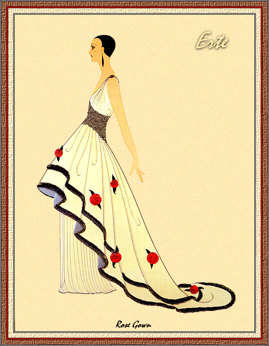
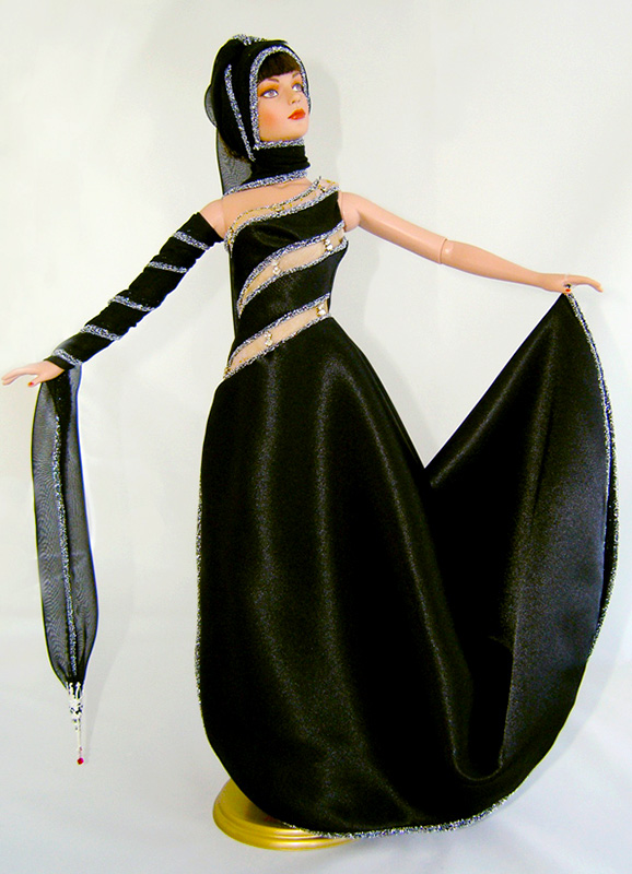
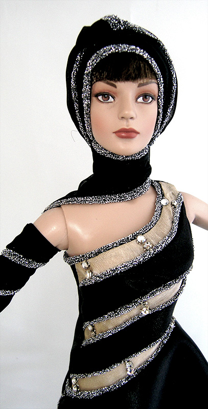
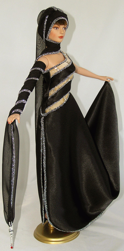
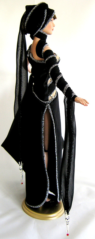
CHALLENGE 8 - KISH
|
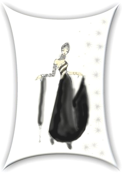
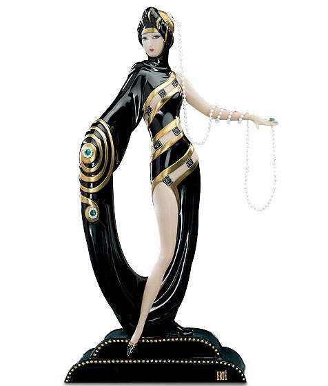
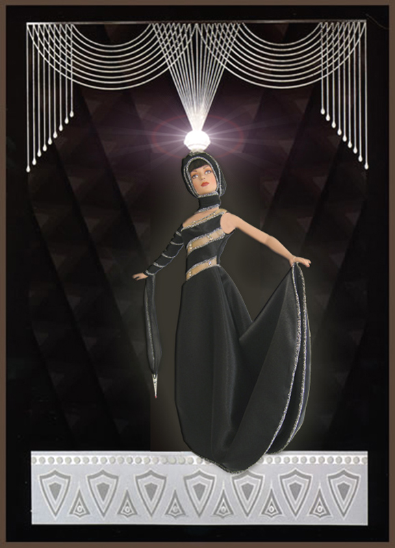
This Challenge was to create a contemporary gown using Erte for inspiration with a reference piece as the basis for the outfit.
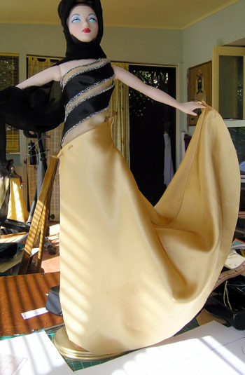
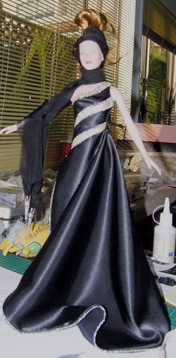
Erte has been my inspiration since I started designing for fashion then film. I have designed quite a few films set in the twenties period and his attention to detail has given me many ideas for trims and special features that I was able to convert and use in my costumes. When this challenge was announced I was really excited and set about finding the reference piece I would use as my inspiration for the challenge gown I have about 15 books of his work and it was with great pleasure I sat down to have a good read :-). There was so much to choose from that in the end it was a hard decision. I like his stark contrast in color and style and wanted to use that aspect of his work. He also uses a lot of silver and gold so when I came across this sculpture I knew it embodied the ideas I wanted to use without turning it into a costume. Below is my chosen sculpture plus a couple of designs that were a possibility along the way but ended up being not quite what I wanted. |
|
|

|
I used black satin for the gown with a silver metallic knit for the binding on all the edges. The hardest part was the inserts of sheer on the bodice. Getting the fit with the tiny pieces meant throwing darts everywhere:-). They are connected by diamantes across the sheer panels. The scarf is very long in sheer black georgette with the same bind on the edges. It has a silver pendant on each end with a crystal and ruby to finish it off. This is then draped over the head and around the arm to give the appearance of a turban and an off the shoulder sleeve. The gown itself is lined with the sheer georgette.
Here are some working pics.
Here are some working pics.

|
|
|
This was one of my favourite challenges and I was so pleased to still be a part of Project Dollway and get the chance to do this gown. Below is the design the way I pictured it to be. As I didn't have the Kish doll I was hoping that it would look the same when Ted came to dress her.
Click on pictures for enlargements
Click on pictures for enlargements
|
THE ERTE CHALLENGE
Using Erte’s “Pearls and Diamonds” as my reference for this challenge I wanted to create a timeless beauty amid modern aesthetic. The sculpture is done in black and gold but I have chosen to use silver trim to match the coloring of the Kish doll being used as the model. Erte is all about bias and drapery and I have based my design on these features. I wanted to make a fitted and elegant bodice shape on the bias and combine his renowned draping into the skirt with the fullness in one side only. This allows the split to open during spontaneous movement. I have combined a silver trim on most edges to outline the flowing lines in this gown. The accompanying scarf has been designed as an ornament of sophisticated whimsy. It can be swathed and coiled to become an apparition of the sleeve and turban in the original sculpture. The fantasy of this is the ability to take on many different guises without compromising the style and grace of the gown (which can also be worn alone with understated elegance ). The scarf has an inserted silver trim and silver pendants suspended each end with crystal and ruby drops. I chose a soft satin for this gown and everything was cut on the bias. The scarf is in georgette, as is the lining of the skirt. Erte’s work is very curvilinear and these fabrics adapt very well to this styling. I have embellished the bodice with crystals that appear to join each panel over the flesh colored inserts. |
|
|
|
|
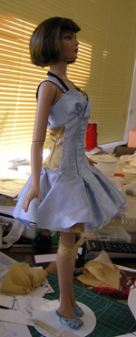
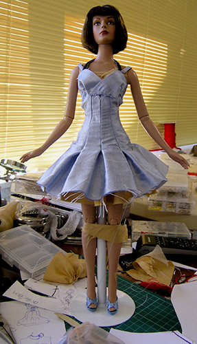
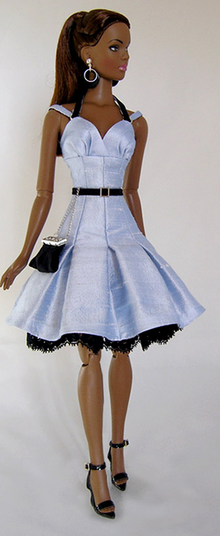
CHALLENGE 9 - GABBY

|
The final challenge was to produce the first outfit of what would be a possible collection.Well here we are at the the last challenge before the final three designers produce a collection. Where to start was my initial dilemma. I think it might have been a color scheme that initiated the process.I decided on powder blue silk, not only because I love the color but because it is an easy shade to wear, no matter what the doll coloring might be. It would certainly suit Gabby's coloring. My complement for this would be black and I used lace to add texture.
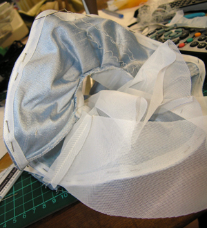
With all that sorted I embarked on my perilous journey. :-) What would I use as the ongoing elements in a collection and what would personify this in a single garment? I wanted to give myself latitude so that my final design had enough detail to allow for a collection with a lot of variety. This was no easy task and not having the doll added to the difficulty! So, with all the fabrics and trims laid out before me I decided on my design detail. Tiny belt, reverse strapping, panels and pleats, lace trims, silver rings, layers, feature earrings and handbag. A lot of detail but I think it comes together well without being obvious. It had to work as a stand alone outfit, even within a collection. With all that in mind here are a couple of pics of the outfit in progress followed by the notes on my design and the picture gallery below. |
|
|
|
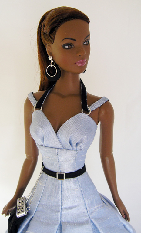
GABBY CHALLENGE
The design style I have used for my collection can best be described as feminine chic with a clean line silhouette. Silk fits this appearance perfectly.
The elements I have embodied to run through the range are evident in the outfit I have elected to represent the whole collection. I have chosen to go with this silk and lace dress as the elements of the collection can be clearly observed within this outfit. I have incorporated a sparingly used contrast of black for a dramatic outcome. A glimpse of lace at the hem to produce a layered effect and add an understated sexiness which will play a more predominant role in additional pieces in the collection.
I envisage the powder blue evolving into silver for some of the styling while maintaining the black for impression. The predominant components of the collection will be: reverse strapping , skinny belts, layering and pleating to varying degrees throughout with silver trimmings. There will be a mix and match ingredient with most pieces showing great versatility.
My inspiration for this collection is a look that is young but sophisticated and chic. A blend of the elegant and alluring, with trim and tailored styling. A range for the “woman” who loves fashion but is not dictated to by it. I want it to have a slice of fun amidst femininity but still comprise beautiful pieces. Perhaps a vintage feel with a more contemporary vibe.
|
|

|
From this outfit I was chosen as one of the 3 finalists! The link below will take you to another page that will continue my final journey producing the 12 outfits that made up my "COVERS" Collection. Join me won't you? :-)